Neura.

About the brand
NEURA is a forward-thinking technology company focused on creating intelligent systems that work with people, not against them. Its products blend precision with empathy, transforming data, ideas, and interactions into seamless experiences.
Mission
To create and enhance technology by making it feel more natural and intuitive day by day. Intuitive, adaptive tools empower people to work smarter, create faster, and connect ideas seamlessly.
Audience
Creative professionals, tech innovators, modern businesses, and everyday users who value design, intelligence, and simplicity.
Key values
- Intelligence: logic, insight, and clarity.
- Innovation: exploring what’s possible.
- Simplicity: complexity refined.
- Trust: transparency and reliability.
Visual approach
To create a logo and brand identity that visually expresses connection, flow, and intelligence, mirroring how NEURA connects people and ideas.
The problem
Technology often feels cold and mechanical. NEURA needed an identity that reflects intelligence and emotion, feeling simple, modern, accessible, and visionary at once.
The design objective
- Feel futuristic, but approachable.
- Work across digital and physical mediums.
- Represent neural pathways and seamless communication.
- Use minimal, geometric elements to express clarity and forward movement.
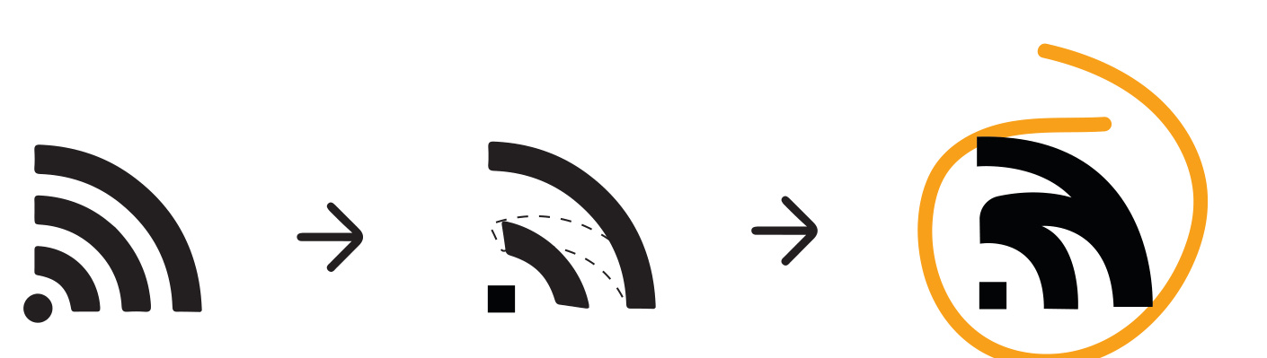
Originating from the familiar Wi-Fi symbol, the curved N represents neural pathways and connectivity. Clean typography reinforces clarity and intelligence.
Logo system
The final identity combines precision and flow, with a primary lockup, simplified wordmark, and standalone symbol.
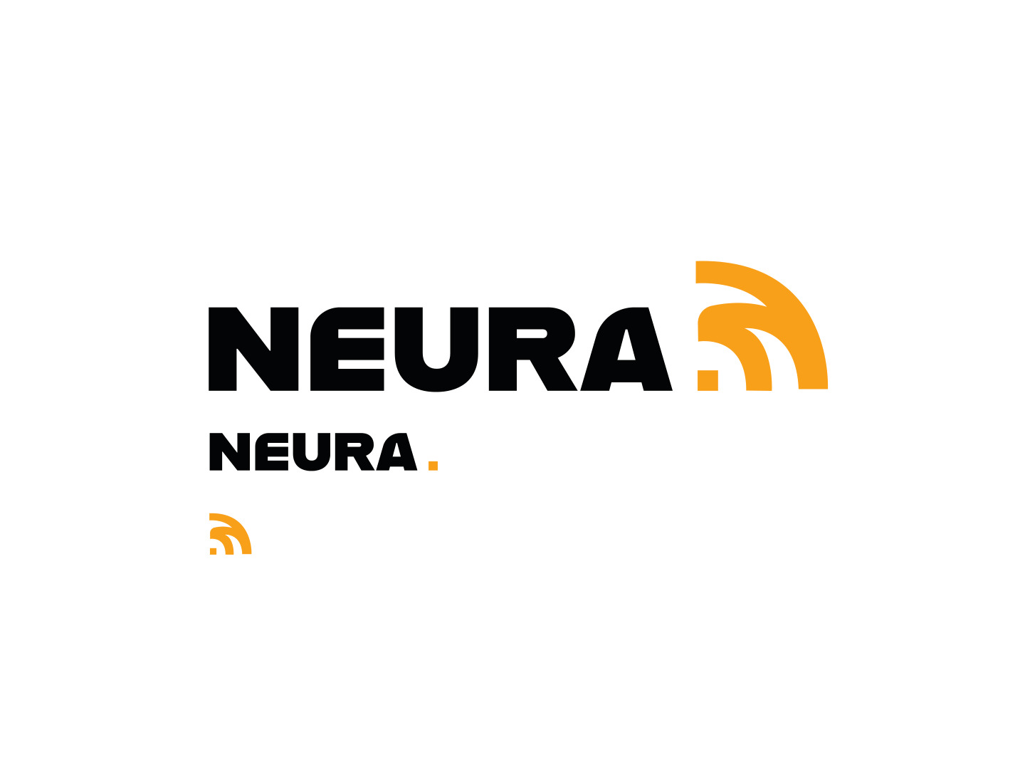

Alfarn
The letters “e” and “a” are slightly modified to connect with the logo’s rounded forms.
Helvetica Light
A simple, modern complement to the brand identity.
Brand in use
The identity adapts across digital and physical environments, maintaining its precision, modernism, and readability.

Digital experience
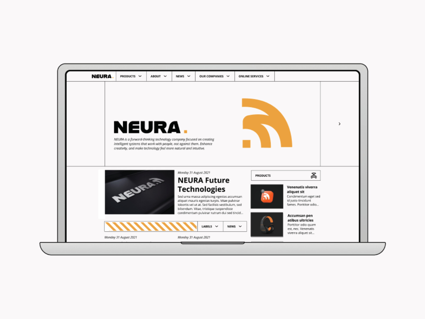
The brand’s visual language continues into the website.
Reflection
Through NEURA’s identity, I aimed to balance simplicity with futuristic precision. Highlighting the brand’s importance of clarity, the result is a visual system that feels intelligent, scalable, and engaging, reflecting the brand’s mission.
From complexity to clarity, NEURA’s brand identity connects simplicity and innovation across digital and physical environments.